
Deadly Sounds Horizontal Poster

Earbuds Package

Headset Package

Package Comp

Package Concepts


Deathly Sounds Project Brief

Company Logo Ideas and Roughs

Activity Board Sheet

Activity Board Final

Activity Board Tight Comp with Words

Activity Board Tight Comp

Activity Board Comp
Activity Board Rough

Gaming Alphabet

Glyphs

Phrases

Alphabet Sketches


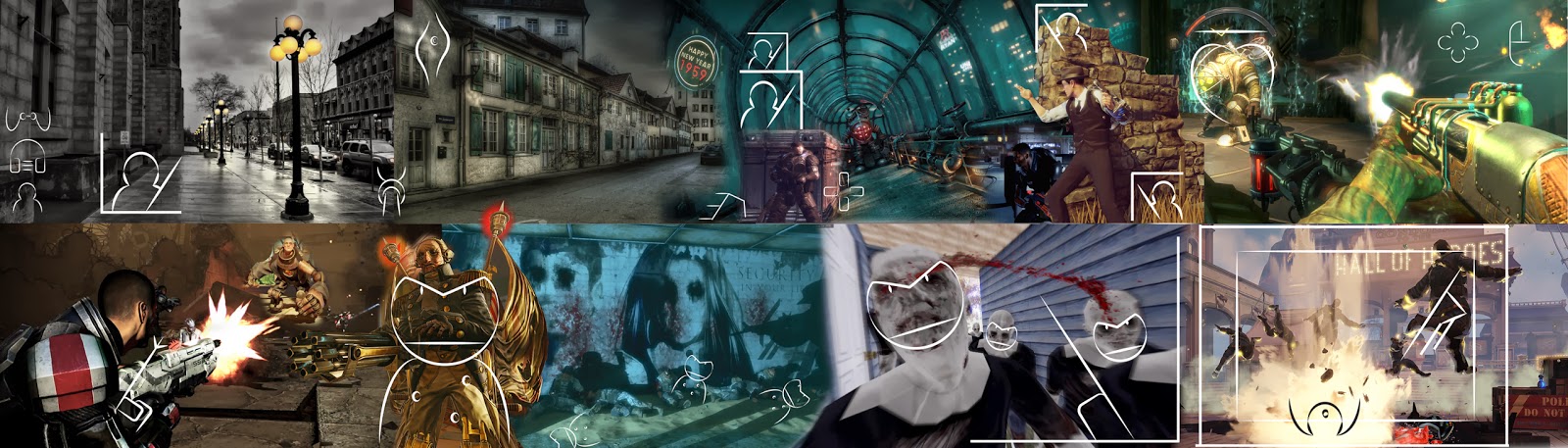
Mood Board


